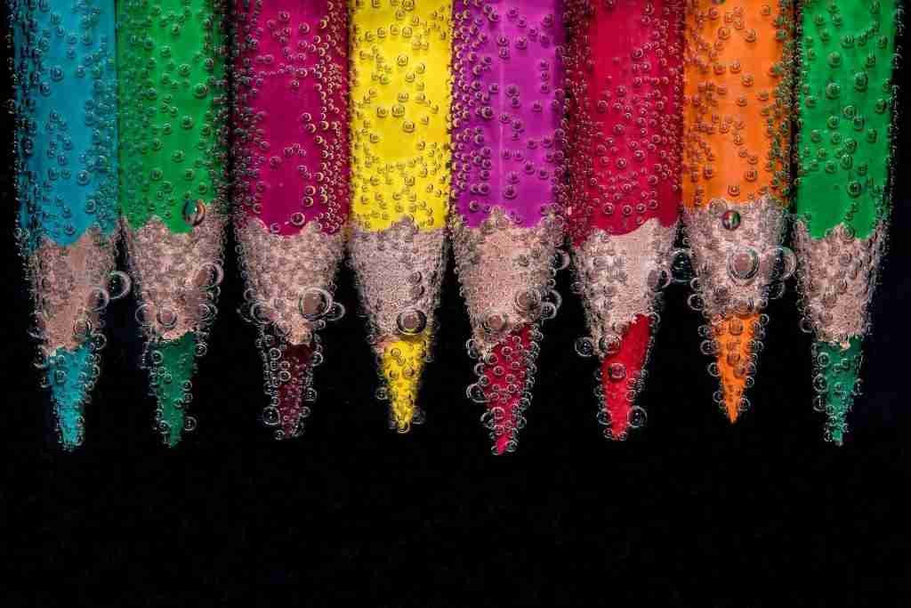
We all know that color can have a profound effect on our emotions and behavior. This is especially true when it comes to web design, where the use of color can be used to influence the emotions of website visitors. In this article, we will explore the effects of different colors on website visitors, and we will provide tips for using color in your web design.
1. What is color psychology
Color psychology is the study of how colors affect human behavior. It looks at the psychological effects of color on both an individual and a group level. Different colors can produce different reactions in people, depending on their personal preferences and cultural background. For example, the color red is often associated with anger or danger, while blue is often seen as calming and peaceful. By understanding the psychological effects of color, businesses and organizations can use color to influence the behavior of their employees or customers.
2. The effects of different colors on website visitors
The colors used on a website can have a profound effect on the way visitors perceive the site. Different colors evoke different emotions, and these emotions can influence the actions that visitors take.
Blue is often seen as a calming color, and it is no coincidence that many websites aimed at relaxation or meditation use this hue. Blue can help to slow down the heart rate and reduce anxiety levels, making it ideal for websites that promote wellness or offer stress-relieving services.
Red, on the other hand, is a much more stimulating color. It has been shown to increase heart rate and blood pressure, and it can also boost energy levels and alertness. Not surprisingly, red is often used on websites that sell fitness products or encourage visitors to take action.
Yellow is another energetic color, but it also conveys optimism and happiness. This makes it a popular choice for websites that are targeting young audiences or selling cheery products.
Orange combines the best of both worlds, offering the stimulation of red with the optimism of yellow. a good use for orange would be a sale website.
Green is often associated with nature and relaxation. This makes it a popular choice for travel websites or those promoting eco-friendly products.
Finally, purple has long been associated with royalty and luxury. Not surprisingly, many high-end brands use this color to convey a sense of sophistication and exclusivity.

3. How to use color in your web design
Now that we understand the psychological effects of different colors, let’s take a look at how to use color in your web design.
The first step is to choose a color scheme. A color scheme is a set of colors that are used together in a design. There are many different ways to create a color scheme, but the most important thing is to choose colors that complement each other. For example, you wouldn’t want to use bright red and green together, as this would be too stimulating. Instead, you might choose blue and green, which are both calming colors.
Once you’ve chosen your color scheme, you can start to think about how to use color in your design. Remember that different colors can create different emotions, so you’ll want to use color deliberately to create the desired effect.
For example, if you’re designing a website for a luxury brand, you might want to use a purple color scheme. This will convey a sense of sophistication and exclusivity. On the other hand, if you’re designing a website for a travel company, you might want to use a green color scheme. This will create a feeling of relaxation and give visitors the impression that your brand is eco-friendly.
The second step is to choose an appropriate color for each element of your design. The colors you use for your text, background, and buttons will all have an effect on the overall tone of your website.
For example, if you’re designing a website with a lot of text, you’ll want to use a light color for the background and a dark color for the text. This will make the text easier to read and create a more professional-looking design.
If you’re designing a website with a lot of images, you might want to use a dark color for the background and a light color for the text. This will help the images stand out and give the design a more modern feel.
Once you’ve chosen your colors, it’s important to use them consistently throughout your design. This will create a cohesive look and make your website more visually appealing.
If you’re not sure how to use color in your web design, consider working with a professional designer. They can help you choose an appropriate color scheme and use color effectively.
There are also several websites that offer free color schemes. These can be a great starting point for your design, and they can help you get an idea of how different colors work together.
Conclusion
A color is a powerful tool that can be used to create emotion in your web design. By understanding the psychological effects of color, you can choose a color scheme that will convey the desired tone of your website. Once you’ve chosen your colors, be sure to use them consistently throughout your design to create a cohesive look.
