
For beginners, building a website might be a difficult undertaking. There are various factors to take into account, such as the design, content, and layout. 20 website design advice for newcomers who are just getting started in web design are provided in this post. You may make a website that is both aesthetically pleasing and user-friendly by using the advice in this article.
20 Website Design Tips For Beginners
1. Choose a layout that is easy to navigate
A well-designed website should have a simple structure that makes it simple for people to access the content they’re looking for. This can be done by employing a straightforward design with a manageable number of menu options and text labels that are both clear and succinct. Additionally, the navigation on the website needs to be consistent.
igation helps users understand their location on a website. You can make sure that your website is user-friendly and aids users in finding the information they require by adhering to these recommendations.
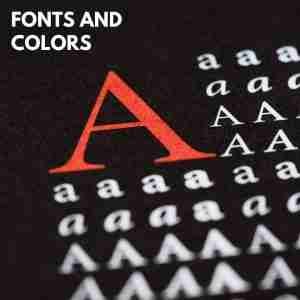
2. Use fonts and colors that are easy on the eyes
Your website’s fonts and colors should be simple to read and easy on the eyes. Sans-serif typefaces, like Arial or Helvetica, work well for web design. On a computer screen, these fonts are straightforward and simple to read. It is preferable to stay with light hues, like white or pastel blue, when choosing colors. These hues are less prone to fatigue the eyes.
It is generally recommended to use a font size of 18px or greater. This will make the text readable for people with low vision as well.
3. Stick to a single style for your website
A common mistake that many businesses make is to try to appeal to everyone with their website. They cram in as much information as possible, use a bunch of different fonts and colors, and include images that are unrelated to their product or service. As a result, their website comes across as busy and confusing, and potential customers are quickly turned off. It’s important to remember that less is often more when it comes to web design. Stick to a single style for your website, and make sure that everything on the page supports your overall message. Use clean lines and simple colors, and resist the temptation to include too much text or too many images. By keeping your website focused and easy to navigate, you’ll be more likely to convert visitors into customers.
4. Make sure all of your content is relevant and helpful
It is crucial to make sure that the information you produce is pertinent and beneficial to your audience, whether it be for a blog post, an essay, or even simply a social media update. Your viewers will value valuable material that is well-targeted given the abundance of information available online. Asking oneself if something would be entertaining or helpful while coming up with ideas for fresh material is a good strategy. Most likely, your readers won’t if the answer is no. Avoid rehashing the same subjects and ideas repeatedly in order to keep your material fresh. You can develop a devoted audience of readers who value your efforts by investing the time to produce pertinent and helpful material.
5. Use images and videos to break up the text
Utilizing a range of graphics will help to properly captivate readers. The text can be interestingly broken up with images and movies. Additionally, images can be used to highlight important details or illustrate a point. Images and videos can be excellent tools for capturing readers’ attention when handled properly. However, it’s crucial to only utilize them when they significantly improve the text. Visuals can be equally distracting when used excessively as when they are absent altogether. In the end, it’s important to find a balance that will interest readers and aid in their understanding of the information being provided.
6. Keep the page size reasonable – avoid long pages that will slow down loading times
There are many distinct aspects of web design to consider. The page size is one crucial factor. A page that is overly long will take longer to load, which can irritate visitors and make them quit before they ever have a chance to view your content. Long pages can be challenging to navigate and may make it tough for consumers to discover the content they’re looking for. Keep your pages brief and simple to scan in general. This will make it more likely that visitors will stay long enough to take advantage of your offerings.
7. Use headings and subheadings to organize your content
Any effective piece of writing, be it an essay, article, or even a shopping list, is structured to be simple to follow for the reader. Using headings and subheadings is one frequent form of arrangement. Subheadings are used to break up larger portions of text into smaller subsections. Headings are used to identify the main divisions of a piece of writing. This method of arrangement makes it simple for readers to access the information they need and aids writers in maintaining mental organization while they are producing their work. Additionally, headers and subheadings can aid in breaking up lengthy passages of text and improve the visual appeal of a piece of writing.
8. Add social media buttons so readers can share your content with others
The quickest and simplest approach to expose your work to a new audience is by using social media buttons. By integrating social media sharing buttons into your website or blog, you enable users to distribute your material among their personal networks. As a result, you may rapidly and easily reach a larger audience without putting in more effort. Additionally, social media buttons might aid in boosting reader engagement from your current audience. People are more likely to check out your stuff when they see that their friends have shared it. In order to increase your online visibility, including social networking buttons is crucial.
9. Use high-quality images and videos
Utilize top-notch photos and videos if you want to leave a lasting impression. When developing marketing materials or websites, this is especially true. Low-resolution photos might give a business a less-than-professional appearance, and visitors won’t be interested in movies with choppy audio or fuzzy picture. It is important to take the time to find high-quality files that will effectively express the desired message while choosing photographs and videos. Fortunately, there are lots of web sources that provide films and photographs that are free to use for commercial purposes. It is simple to locate the appropriate visuals to assist any project with a little effort.
10. Test your website on different browsers and devices
Testing your website across a range of browsers and devices is essential if you want to make sure that it is accessible to the broadest audience possible. It’s crucial to test your website across all popular browsers, including Internet Explorer, Firefox, Safari, and Chrome, as different web browsers can render web pages differently. People also access the internet through a number of gadgets, such as desktop and laptop computers, tablets, and smartphones. You must test your website across the widest range of devices if you want to ensure that it functions and looks well on each one. There are several website testing tools that can make this process simpler.
11. Proofread your content for errors
There isn’t a secret trick to crafting the ideal piece of content, but there are a few things you can do to increase your chances of success. The most crucial step is to review your writing for faults before publishing it. It is usually a good idea to run your work through a spell checker and grammar checker before hitting the publish button, even if you are confident in your spelling and punctuation. Making the effort to check your work for faults can help you present yourself professionally and may mean the difference between success and failure. Therefore, the next time you sit down to write, keep in mind to edit your work before publishing it.
12. Use web-safe fonts only
Any web designer will tell you that selecting the ideal font is crucial to producing a successful website. In addition to contributing to a website’s overall look and feel, fonts also aid in communicating its message and tone. But not all fonts are made equally. Some fonts, but not all, are created expressly for usage online. All popular browsers and operating systems can utilize web-safe fonts without any issues. This indicates that they are less likely to cause issues when viewed on various platforms or devices. While there might be a few exceptions, it is generally advised to choose web-safe fonts when creating websites.
13. Don’t use too many animations or effects
Using too many animations or effects is a typical error made when developing websites. A little bit of animation can assist focus attention to crucial details, but too much of it can be distracting and even dizzying. A website may also look unprofessional if effects are overused. Animations and effects are potent tools if used properly. In order to prevent overwhelming your viewers, it’s crucial to employ them carefully.
14. Don’t rely on auto-advancing slides
Although auto-advance can be useful in some circumstances, it’s crucial to keep in mind that not all viewers will find it appealing. In fact, it might irritate or even frustrate some viewers. Give viewers the option to disable auto-advance if you plan to use it. They can view your website at their own pace and won’t miss anything crucial if you do it that way.
15. Make sure your audio is high quality
It’s crucial to ensure that any audio you use on your website is of a good standard. Poor audio might be confusing and give the impression that your website is unprofessional. Before you share your website with others, make sure to utilize high-quality audio files and test them on various devices to avoid these issues.
16. Use graphics sparingly
A website’s visual appeal can be greatly increased with the use of graphics. However, it’s crucial to only employ them sometimes. Too many visuals can be distracting and make it challenging for visitors to concentrate on your website’s key messages. When used properly, graphics may highlight your main ideas and increase the recall value of your website. Nevertheless, it’s crucial to utilize them sparingly to prevent tiring out your audience.
17. Avoid using stock photos
Although using stock photographs on your website may be alluring, you should keep in mind that they can make it appear unprofessional. If you must utilize stock photos, make sure to pick high-quality pictures that relate to your subject. Additionally, make an effort not to choose extremely corny or overused photos. Choosing your photographs wisely can help you achieve the goal of creating a website that seems clean and professional.
18. Use Color Psychology
Color can be a powerful tool in persuasion. Different colors evoke different emotions, so it is important to choose your colors carefully. When used correctly, color can help to emphasize your key points and make your website more memorable. However, it is important to use color judiciously in order to avoid overwhelming your audience.
19. Stick to a consistent layout
A consistent layout is important for two reasons. It first promotes unity. It also makes it simpler to navigate your website. When visitors see a consistent layout, they will be able to quickly distinguish the various sections of your website and concentrate on the content that you want them to remember.
20. Don’t be afraid to experiment
Don’t be scared to experiment with your website design, even though it is crucial to go by the aforementioned advice. After all, one of the fun aspects of web design is testing out several concepts to determine which ones perform best for you and your target audience. So go ahead and give new things a try. Who knows, you might have the idea for the upcoming breakthrough in website design.